本文转自http://www.codeproject.com/KB/buttons/RoundButton_csharp.aspx
Introduction
The button presented in this example has been developed in stages. I shall walk you through the stages one by one, so that you can create a custom control yourself easily. Round buttons are specific cases of elliptic buttons.
Overview
My motivation for this article started with me trying to imitate the round button of Windows Media Player. I wanted to create a custom control in C# and round button is a control developers popularly try to implement when implementing custom controls. I searched codeproject and google, there was none, and I decided to create one myself.
Custom controls are easier to create in C# than in MFC, thanks to FCL. There was an article by Chris Maunder on how to create an elliptic button using MFC. The code in this sample looks simpler because of some FCL functions that come free.
What�s Special About this Button
The button I developed has the following properties:
- It is elliptical/ round
HoverColor� color of the button when you hover over itTextStartPoint� point at which we start drawing text of the button. Coordinates are relative to upper-hand left corner of the bounding rectangle of the button.ColorGradient� This parameter allows you to shade the button. Indicates how sharp a color transition you want.ColorStepGradient� Indicates how many every pixels you want color change.FadeOut� Indicates if you want darker color outside or inside. Indicate true for darker color along the rim, and false for lighter.
Why should You use Round Buttons?
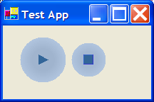
Why would you create a round button at all? First, if you want nice UI. Second, if a regular rectangular button is not as good as one, for example, that looks like a cigar. Windows Media Player�s play button mimics today�s round buttons on multimedia player stations and conveys the idea more accurately than a rectangular one.
It is easier to create a round button in C#, and you would like to use .Net to create it if you want it to seamlessly integrate with other UI development environments like VB.Net. In order to use it, you�d need an operating system with the .Net framework installed. In order to replace buttons in existing projects with this new one, you want to replace the word Button by RoundButton in the InitializeComponents() function in your forms and add a reference to the dll hosting code for this button.
C# Background
The mother of all controls in C# is the Control class. It has all the features that you�d want out of a control and MSDN describes the features well. If you are authoring a new control and your control is going to be similar to a standard existing control, you will do well to extend that class. In our example, we extend the Button class. To create a listbox having checkboxes and showing images instead of text, you would extend the CheckedListBox class. If you want to create a control from scratch that has no behavioral resemblance to any controls that you know of, you want to extend the UserControl class. You can create a composite control also using UserControl.
Basic Philosophy
The basic philosophy to create a round button is simple � extend the Button class, have a Paint handler, draw your ellipse in the handler. There are other intricacies, however. If you are having your own Paint handler, you will not be calling the default Paint handler, which means more responsibilities:
- You will have to set the region for the button so that if the user clicks at a point which lies outside the bounding circle but inside the bounding rectangle, that does not translate to a click.
- You would affect other properties related to drawing like: text, image and backgroundImage. If you are not calling the default
Painthandler, you have to draw the text and images, aligned as the user wants them.
La Code
Time to code. In the following, I describe briefly the steps in which I developed this button.
Step 1
Simple round button. Visuals done. Behaviorally similar to a rectangular button. We create one pen and one brush. The pen, to draw the boundary ellipse/ circle; the brush: to fill interior of the ellipse.
constructor:
{
      _pen = new Pen(_color);
      _brush = new SolidBrush(Color.FromKnownColor (KnownColor.Control));
      _brushInside = new SolidBrush(_color);
}

// OnPaint�
protected override void OnPaint(PaintEventArgs pe)
{
      Graphics g = pe.Graphics;
      g.FillRectangle(_brush, 0, 0, ClientSize.Width, ClientSize.Height);
      g.DrawEllipse(_pen, 0, 0, ClientSize.Width, ClientSize.Height);
      g.FillEllipse(_brushInside, 0, 0, ClientSize.Width, ClientSize.Height);
}
Additionally, you want to expose a color property that the end user can populate in design mode.
Step 2
The implementation in Step 1 has a bug: if you click at a point which lies outside the bounding circle but inside the bounding rectangle, that gets interpreted as a click.
To fix that, we add the following code in OnPaint to set the window region correctly:
      GraphicsPath path = new GraphicsPath();
      path.AddEllipse(0, 0, ClientSize.Width, ClientSize.Height);
      this.Region = new Region(path);
Step 3
Rest of the code should be easy to interpret. I have developed functions, step by step, to make the coloring code more appealing and fixing problems because we are avoiding the call to the default Paint handler. I called the function where I do the painting inside the button in OnPaint() as ColorButton, and developed different versions of ColorButton().
Brief overview of the functions:
ColorButton1� flat coloring of the buttonColorButton2� fills color with color gradient. Color gets darker towards the righthand-bottom corner.ColorButton3- fills color with color gradient. Color gets darker towards the center. Respects the image property set by the userColorButton4� Adds fade-in/ out property. Color gets lighter (fade out) or darker (fade in) towards the center.ColorButton5�ColorButton4modified to take in pen and brush arguments. Needed for hover-coloring. I added handlers forMouseEnterandMouseLeaveto color the button differently on mouse hover. Draws a focus rectangle when the button has focus.
Using the Button
In a fresh project, go to the Toolbox, add / remove items, browse and point to the dll for the button. In an existing project, change text Systems.Windows.Forms.Button to AdvButton.RoundButton.
Known Issues
These are known issues:
- It disregards
TextAlignproperty - It disregards
ImageAlignproperty - Does not give a perfect 3D look, consequently, the property
FlatStyleis ignored
Other Considerations
Note that we have taken care of:
- Windows accessibility requirements
- Localization issues. Text written in a right-to-left language will appear fine.
Future improvements
The properties ImageAlign and TextAlign are currently ignored. The image is currently drawn at the center and text coordinates depends on the property TextStartPoint.
References
-
Round button - http://www.codeproject.com/buttonctrl/roundbuttons.asp, by Chris Maunder
License
This article has no explicit license attached to it but may contain usage terms in the article text or the download files themselves. If in doubt please contact the author via the discussion board below.
A list of licenses authors might use can be found here