文章目录
- Those Summer Desires
- Inspiring Type
- Life is Either a Daring Adventure or Nothing
- Milk with Knves
- Avoid Making a Mess
- Every Damn
- Pick your life Don’t LET IT pick you
- Some Prefer Milk
- Todays Visual Experience
- Up for Air
- Noodle Doodle
- ALL FOR YOUR EXCELLENCE
- FUERZA
- Live to Eat Tolive
- Adult Film
- We Do Not Take a Trip
- Top Rock
- Wherever You Go, Go With All Your Heart
- Treasure Island
- Chocotoy is Love
- Friday Type
- Life Saver
- Starrify
- Best Of Boston 2012
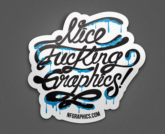
- NFG Sticker
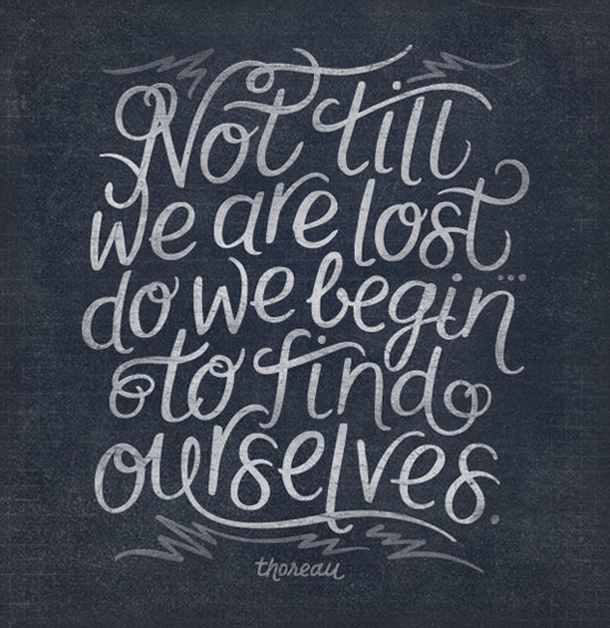
- Not Till We Are Lost
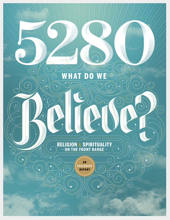
- 5280 Magazine
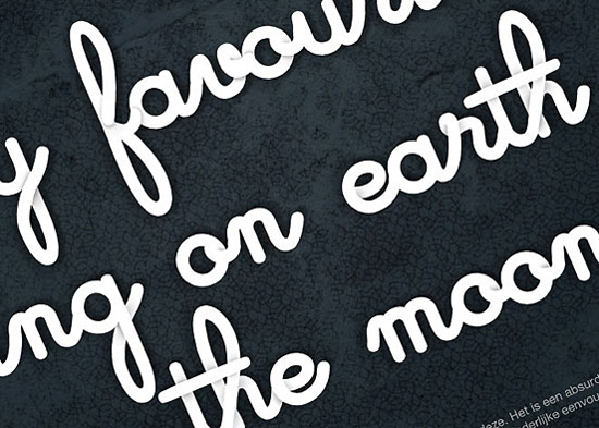
- The Moon
- Brooklyn Taco CO.
- Goverdose
- VOID
- It Is Not Down On Any Map
- Typography
- So Sweet
- Forward Button
- Typographic ID’s – History Channel
- WE LOVE NY
- Where do ideas come from?
- KANDINSKY TYPE
- Skulls &l Quotes
- TWTH by BMD Design
- Cafe Racer by bmd design
- Bolyar Ornate by the Fontmaker
- Drop Type Font
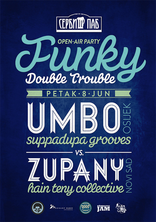
- Funky Double Trouble
- we love typography
- ECO
- Payphone Typography
- imagine
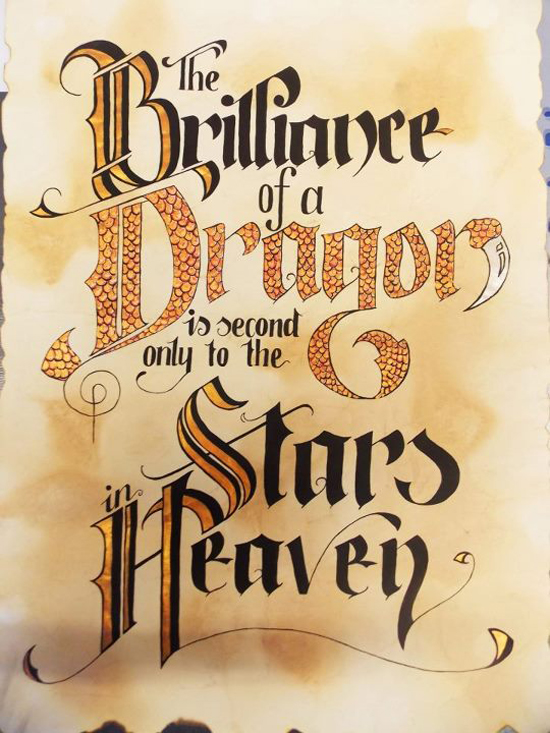
- The Brilliance Of a Dragon
字体设计现在是更受欢迎的一种新潮的字体组合在网站上,排版是字形打印的外观的设计。
数字艺术排版,在 2012 年的网页设计当中是一个大的趋势。这种设计尝试选择用时尚的字体、 粗体或加粗的颜色,从不同的角度在字体的元素上进行排版, 工作。它被广泛使用在徽标、 海报和网站上。它不仅吸引参观者注意而且还在你的网站上创建很酷的外观。
Those Summer Desires

Inspiring Type

Life is Either a Daring Adventure or Nothing

Milk with Knves

Avoid Making a Mess

Every Damn

Pick your life Don’t LET IT pick you

Some Prefer Milk

Todays Visual Experience

Up for Air

Noodle Doodle

ALL FOR YOUR EXCELLENCE

FUERZA

Live to Eat Tolive

Adult Film
We Do Not Take a Trip

Top Rock

Wherever You Go, Go With All Your Heart

Treasure Island

Chocotoy is Love

Friday Type

Life Saver

Starrify

Best Of Boston 2012

NFG Sticker
Not Till We Are Lost
5280 Magazine
The Moon
Brooklyn Taco CO.

Goverdose
VOID

It Is Not Down On Any Map

Typography

So Sweet

Forward Button

Typographic ID’s – History Channel

WE LOVE NY

Where do ideas come from?

KANDINSKY TYPE

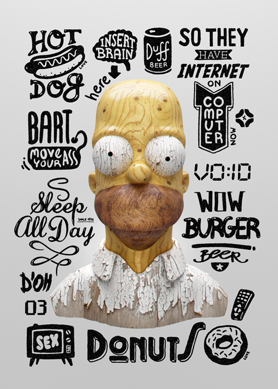
Skulls &l Quotes

TWTH by BMD Design
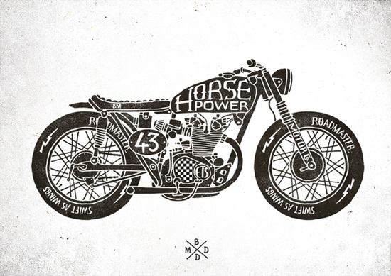
Cafe Racer by bmd design
Bolyar Ornate by the Fontmaker

Drop Type Font

Funky Double Trouble
we love typography

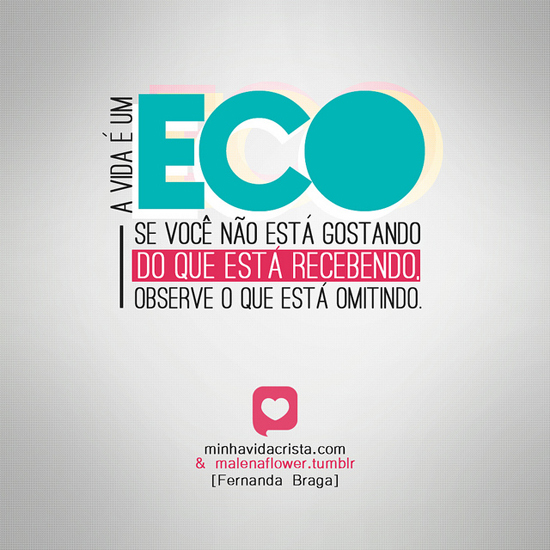
ECO
Payphone Typography

imagine

The Brilliance Of a Dragon