我们都知道Window有多种主题(Theme)。一般情况下,显然我们会希望不同主题下,我们的应用程序的行为不会有变化。或者说,我们不希望为了特定的主题,为控件写特定的逻辑。然而不幸的是,.NET Framework里一些控件自带的主题就存在问题,使得我们不得不在使用时,为这个控件在特定的主题下特殊处理。
下面举一个例子。在ListBox里放CheckBox,组成一个CheckBoxList应该是一个比较常见的应用。从理论上来说,在WPF里最简单的方式就是在ListBox的ItemTemplate里或是ItemContainerStyle里放一个CheckBox就可以了。
但是实际上,在做这个简单的CheckBoxList的时候,会遇到一个又一个的问题。首先重申一下文本的意图,怕自己又没有说明白误导大家。本文不是讨论CheckBoxList里的蓝条问题,而是在讨论CheckBox在不同主题下的不同行为的问题。CheckBoxList仅仅是个例子。
先来看看效果图。
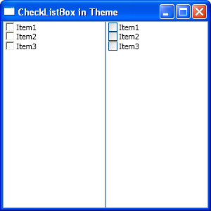
图1. 两种主题下的CheckBox
在上图中,左侧是Classic主题下的CheckBox。右侧是XP默认的Luna主题下的CheckBox。
问题1. CheckBox的IsChecked状态与ListBoxItem的IsSelected状态不同步。如果你想保留选中时的蓝条,那么比较好办,把这两个属性Binding到一起就可以了。如果你不想要那个选中时的蓝条,会稍稍复杂一些。解决方案很多,就不赘述了。示例程序中,为减少干扰,不对这个问题进行解决。
问题2. CheckBox所在的Item被选中时,为蓝色。CheckBox里的文字为黑色,这个与ListBoxItem的默认颜色行为不一致。为了让CheckBox在被选中时文字为白色并不难,写个Binding就OK了。这个根本不是问题,但是解决这个问题,造成了下面的问题,才是主要问题。(当然,如果你隐藏了蓝条,就没有任何问题。)
问题3. 这个是这篇文章的主要议题,看看下面几个图就知道了。我们对两边的CheckBoxList做同样的操作。先来右边的。
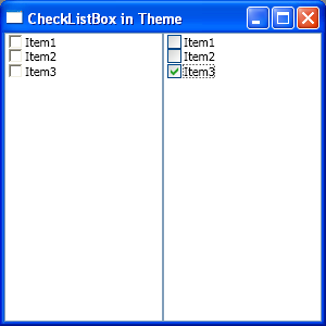
图2. 选中最后一个CheckBox
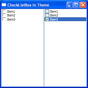
图3. 点击刚才选中CheckBox边上的空白,使其选中
注意,这里CheckBox里的勾还是可见的。很费话是吧,怎么可能不见?下面让你来见识一下,Classic主题下的勾就看不到了。跟没有选中一样。
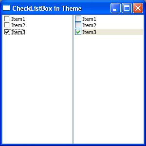
图4. 选中经典CheckBox,勾可见
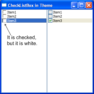
图5. 点击空白,选中它,勾不见了
再给个提示,注意图2和图3,之间的变化,Item3被选中之后,变成了白色。而勾的颜色没有变。再来看图4和图5。
应该已经猜到了吧?没有错,Classic主题下,CheckBox里的勾也成了白色的。
熟悉WPF的人应该也已经猜到了,这个是由于不同主题下,CheckBox的默认Template的实现不同所导致的。下面是CheckBox在不同主题下的代码。(直接来自于Blend,根本来源是.NET Framework里的PresentationFramework.Classic和PresentationFramework.Luna两个DLL。)
<ResourceDictionary
xmlns="http://schemas.microsoft.com/winfx/2006/xaml/presentation"
xmlns:x="http://schemas.microsoft.com/winfx/2006/xaml"
xmlns:Microsoft_Windows_Themes="clr-namespace:Microsoft.Windows.Themes;assembly=PresentationFramework.Classic">
<!-- Resource dictionary entries should be defined here. -->
<Style x:Key="CheckRadioFocusVisual">
<Setter Property="Control.Template">
<Setter.Value>
<ControlTemplate>
<Rectangle Stroke="Black" StrokeDashArray="1 2" StrokeThickness="1" Margin="14,0,0,0" SnapsToDevicePixels="true"/>
</ControlTemplate>
</Setter.Value>
</Setter>
</Style>
<Style x:Key="EmptyCheckBoxFocusVisual">
<Setter Property="Control.Template">
<Setter.Value>
<ControlTemplate>
<Rectangle Stroke="Black" StrokeDashArray="1 2" StrokeThickness="1" Margin="1" SnapsToDevicePixels="true"/>
</ControlTemplate>
</Setter.Value>
</Setter>
</Style>
<Style x:Key="ClassicCheckBoxStyle" TargetType="{x:Type CheckBox}">
<Setter Property="FocusVisualStyle" Value="{StaticResource CheckRadioFocusVisual}"/>
<Setter Property="Foreground" Value="{DynamicResource {x:Static SystemColors.WindowTextBrushKey}}"/>
<Setter Property="Background" Value="{DynamicResource {x:Static SystemColors.WindowBrushKey}}"/>
<Setter Property="BorderBrush" Value="{x:Static Microsoft_Windows_Themes:ClassicBorderDecorator.ClassicBorderBrush}"/>
<Setter Property="BorderThickness" Value="2"/>
<Setter Property="Padding" Value="2,0,0,0"/>
<Setter Property="FocusVisualStyle" Value="{StaticResource EmptyCheckBoxFocusVisual}"/>
<Setter Property="Template">
<Setter.Value>
<ControlTemplate TargetType="{x:Type CheckBox}">
<BulletDecorator SnapsToDevicePixels="true" Background="Transparent">
<BulletDecorator.Bullet>
<Microsoft_Windows_Themes:ClassicBorderDecorator x:Name="CheckMark" Background="{TemplateBinding Background}"
BorderBrush="{TemplateBinding BorderBrush}" BorderStyle="Sunken" BorderThickness="{TemplateBinding BorderThickness}">
<!-- The following Path Binding Fill to Foreground of Templated parent, which is different from Luna's template -->
<Path x:Name="CheckMarkPath" Fill="{TemplateBinding Foreground}" FlowDirection="LeftToRight" Margin="1,1,1,1"
Width="7" Height="7" Data="M 0 2.0 L 0 4.8 L 2.5 7.4 L 7.1 2.8 L 7.1 0 L 2.5 4.6 Z"/>
</Microsoft_Windows_Themes:ClassicBorderDecorator>
</BulletDecorator.Bullet>
<ContentPresenter HorizontalAlignment="{TemplateBinding HorizontalContentAlignment}" Margin="{TemplateBinding Padding}"
VerticalAlignment="{TemplateBinding VerticalContentAlignment}" SnapsToDevicePixels="{TemplateBinding SnapsToDevicePixels}" RecognizesAccessKey="True"/>
</BulletDecorator>
<ControlTemplate.Triggers>
<Trigger Property="IsChecked" Value="false">
<Setter Property="Visibility" TargetName="CheckMarkPath" Value="Hidden"/>
</Trigger>
<Trigger Property="IsChecked" Value="{x:Null}">
<Setter Property="Background" TargetName="CheckMark" Value="{DynamicResource {x:Static SystemColors.ControlLightLightBrushKey}}"/>
<Setter Property="Fill" TargetName="CheckMarkPath" Value="{DynamicResource {x:Static SystemColors.ControlDarkBrushKey}}"/>
</Trigger>
<Trigger Property="IsPressed" Value="true">
<Setter Property="Background" TargetName="CheckMark" Value="{DynamicResource {x:Static SystemColors.ControlBrushKey}}"/>
</Trigger>
<Trigger Property="IsEnabled" Value="false">
<Setter Property="Background" TargetName="CheckMark" Value="{DynamicResource {x:Static SystemColors.ControlBrushKey}}"/>
<Setter Property="Fill" TargetName="CheckMarkPath" Value="{DynamicResource {x:Static SystemColors.GrayTextBrushKey}}"/>
<Setter Property="Foreground" Value="{DynamicResource {x:Static SystemColors.GrayTextBrushKey}}"/>
</Trigger>
</ControlTemplate.Triggers>
</ControlTemplate>
</Setter.Value>
</Setter>
</Style>
</ResourceDictionary>
代码1. Classic主题下CheckBox的默认Template
<ResourceDictionary
xmlns="http://schemas.microsoft.com/winfx/2006/xaml/presentation"
xmlns:x="http://schemas.microsoft.com/winfx/2006/xaml"
xmlns:Microsoft_Windows_Themes="clr-namespace:Microsoft.Windows.Themes;assembly=PresentationFramework.Luna">
<!-- Resource dictionary entries should be defined here. -->
<LinearGradientBrush x:Key="CheckRadioFillNormal">
<GradientStop Color="#FFD2D4D2" Offset="0"/>
<GradientStop Color="#FFFFFFFF" Offset="1"/>
</LinearGradientBrush>
<LinearGradientBrush x:Key="CheckRadioStrokeNormal">
<GradientStop Color="#FF004C94" Offset="0"/>
<GradientStop Color="#FF003C74" Offset="1"/>
</LinearGradientBrush>
<Style x:Key="LunaCheckBoxStyle" TargetType="{x:Type CheckBox}">
<Setter Property="Foreground" Value="{DynamicResource {x:Static SystemColors.ControlTextBrushKey}}"/>
<Setter Property="Background" Value="{StaticResource CheckRadioFillNormal}"/>
<Setter Property="BorderBrush" Value="{StaticResource CheckRadioStrokeNormal}"/>
<Setter Property="BorderThickness" Value="1"/>
<Setter Property="FocusVisualStyle" Value="{StaticResource EmptyCheckBoxFocusVisual}"/>
<Setter Property="Template">
<Setter.Value>
<ControlTemplate TargetType="{x:Type CheckBox}">
<BulletDecorator SnapsToDevicePixels="true" Background="Transparent">
<BulletDecorator.Bullet>
<Microsoft_Windows_Themes:BulletChrome Background="{TemplateBinding Background}" BorderBrush="{TemplateBinding BorderBrush}"
BorderThickness="{TemplateBinding BorderThickness}" IsChecked="{TemplateBinding IsChecked}"
RenderMouseOver="{TemplateBinding IsMouseOver}" RenderPressed="{TemplateBinding IsPressed}"/>
</BulletDecorator.Bullet>
<ContentPresenter HorizontalAlignment="{TemplateBinding HorizontalContentAlignment}" Margin="{TemplateBinding Padding}"
VerticalAlignment="{TemplateBinding VerticalContentAlignment}"
SnapsToDevicePixels="{TemplateBinding SnapsToDevicePixels}" RecognizesAccessKey="True"/>
</BulletDecorator>
<ControlTemplate.Triggers>
<Trigger Property="HasContent" Value="true">
<Setter Property="FocusVisualStyle" Value="{StaticResource CheckRadioFocusVisual}"/>
<Setter Property="Padding" Value="2,0,0,0"/>
</Trigger>
<Trigger Property="IsEnabled" Value="false">
<Setter Property="Foreground" Value="{DynamicResource {x:Static SystemColors.GrayTextBrushKey}}"/>
</Trigger>
</ControlTemplate.Triggers>
</ControlTemplate>
</Setter.Value>
</Setter>
</Style>
</ResourceDictionary>
代码2. Luna主题Normal配色方案下,CheckBox的默认Template
从上面两段代码可以看出,Classic主题下的CheckBox的勾的颜色绑定到了CheckBox本身的Foreground属性上,但是Luna主题下的没有这样做(Luna下的CheckBox的勾是用BulletChrome画的)。也许微软这样做有自己的考虑,但是从目前的结果来看,没有带来实现的好处,却带来了不小的麻烦,因为这个小问题并不是想象中那么容易完美解决的。
给出几个方案。
1. 不把CheckBox的Foreground与ListBoxItem的Foreground绑定。然后解决CheckBox黑色文字与蓝条的冲突问题。方案之一就是改变蓝条成灰条,橙条,颜色