怎么制作功能强大的位图按钮控件
系统:WindowsXP P
环境:Visual Studio.NET 2003 语言:C# 源码下载
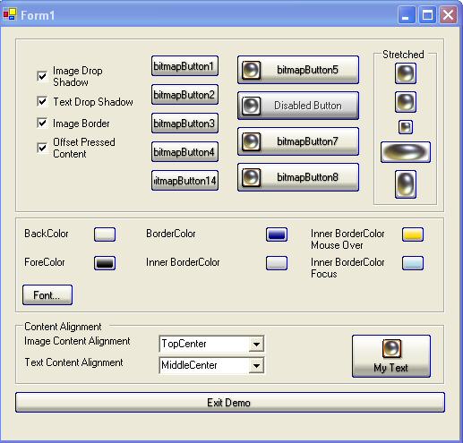
在开始我们的讲解之前先看一下我们位图Button控件的效果(很漂亮吧!)如果你对这个控件感兴趣的话,就跟着我们的脚步学习如何做出这样的一个控件吧!
简介:
创建自定义位图控件的目的是允许在每一种按钮状态下呈现不同的位图,这些状态包括:disabled, normal, mouse over,还有button pressed;除了按钮的图像,让我们的按钮饱含文本,并且根据按钮图片控制文本的对齐方式也很重要。按钮采用XP样式,还包含了我们定制的一些特性。
代码使用:
程序的源码可以分为3大部分:data(数据), rendering(表现), and events(事件)
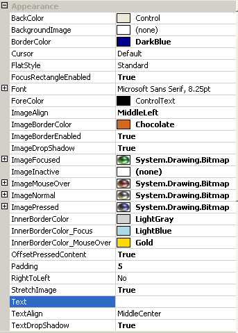
Data:存储状态和设置属性的私有变量,下表中有每一个属性的描述。
Rendering:按钮的呈现是靠几个方法来实现的,OnPaint方法是调用其它绘制方法的一个驱动性质的方法(意思就是靠我们的OnPaint方法,调用自定义的绘制方法),用来呈现我们的Button控件
Events:事件处理操作按钮的状态这些事件有:OnMouseDown, OnMouseUp, OnMouseLeave, OnMouseMove, OnEnabledChanged, OnLostFocus.
Data:
首先让我们研究一下这些属性
|
BITMAP BUTTON PROPERTIES |
||||||||||||||||||||||||||||||||||||||||||||
|
所有的这些属性都被加到属性标签页了,下面是个截图:
Rendering:
按钮控件的呈现工作是OnPaint方法实现的,它轮流调用几个方法呈现Button我们设置的状态。
CreateRegion: 创建按钮的圆角边框paint_Background: 绘制呈现按钮背景paint_Text: 绘制呈现按钮文本和文本阴影paint_Border: 绘制 1像素的按钮边框paint_InnerBorder: 绘制 2像素的按钮内边框paint_FocusBorder: 绘制 1像素的按钮虚线焦点边框

 /**//// <summary>
 /// This method paints the button in its entirety./// </summary>
 /// <param name="e">paint arguments use to paint the button</param>
 protected override void OnPaint(PaintEventArgs e)
 { CreateRegion(0); paint_Background(e); paint_Text(e); paint_Image(e); paint_Border(e); paint_InnerBorder(e); paint_FocusBorder(e);}
绘制背景应该是很有趣的:
Painting the background can be of some interest. The approach that was taken allows for a gradient background interpolation between multiple colors (meaning more then 2 colors). First, a blend object needs to be initialized with an array of colors, and the position of interpolation. Next, the gradient brush can be created as usual. The Final step involves linking the blend object to the brush. This is accomplished by setting the InterpolationColors property of a brush.
下面是复合颜色的代码示例:
Color[] ColorArray = new Color[]{ System.Drawing.Color.White, System.Drawing.Color.Yellow, System.Drawing.Color.Blue, System.Drawing.Color.Green, System.Drawing.Color.Red, System.Drawing.Color.Black};